Edward Jones Investments Homepage Redesign
OVERVIEW
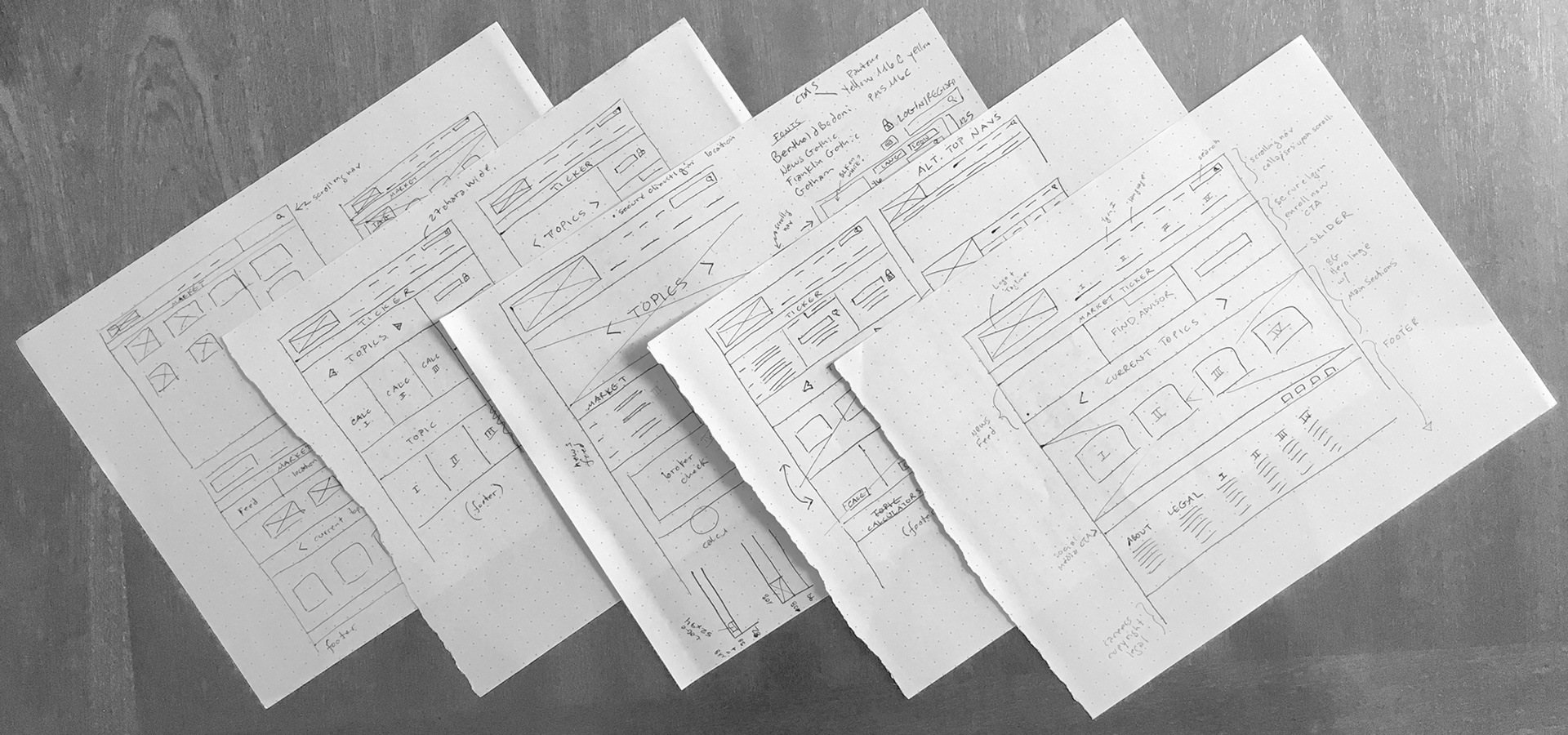
I was challenged to redesign the home page of any Web site I felt could benefit from an upgrade. Because of my personal interest in financial markets and a desire to make all information serviceable, I researched the sites of every financial institution I could find. Edward Jones stood out to me as not standing up to its competitors.
PROCESS
Compared to their competitors, the design is cluttered and the color choices are literally alarming (red-orange and yellow!). They need to inspire confidence, security, and reliability concerning money, not alarm. I found access to their style guides which allowed me to see which of the current design choices were non-negotiable and where I had room to innovate. I found that the yellow was critical to Edward Jones' branding, but the other colors could go. I chose a sleek, minimal palette focusing on the yellow and black that are core to the Edward Jones' brand. Making the photos black and white also reduced visual noise and added elegance to the overall look and feel. I added a few more icons to have some non-rectilinear elements to break up the angles.

After some heuristic analysis, I also shortened the nav titles which are cumbersome in length, and removed some sections on the homepage that are accessible through the navigation and unnecessary for first-view. I wanted to make the homepage as simple as possible, making assumptions on what the most important information for both a first-time visitor and a regular customer might be.

MOBILE VERSION
Translating a desktop page into mobile is an act in minimalism. It was necessary to further reduce the content on the homepage and the leave the important information to be easy to access on smaller screens using different interaction movements.
An assumption was made that first-time visitors would be more likely to look up the site on a Desktop device where one usually has more privacy, more access to personal files and a more stable setting, so returning visitors would be using the navigation symbol heavily to go directly to their desired destination.