OVERVIEW
Zanzo Studios is an independent video game company needing a logo. The principle already had a clear vision in mind, yet through the process of crafting the logo we found a better direction.
PROCESS
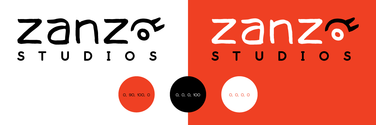
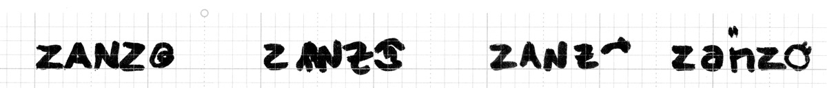
The company principle had envisioned a simplified combination of eye and a brain, where the brain was the pupil. They also wanted a hand-made look. Starting with black ink and brush, I did an initial round of sketches. We both felt the simplified version of a brain was not reading the desired way.
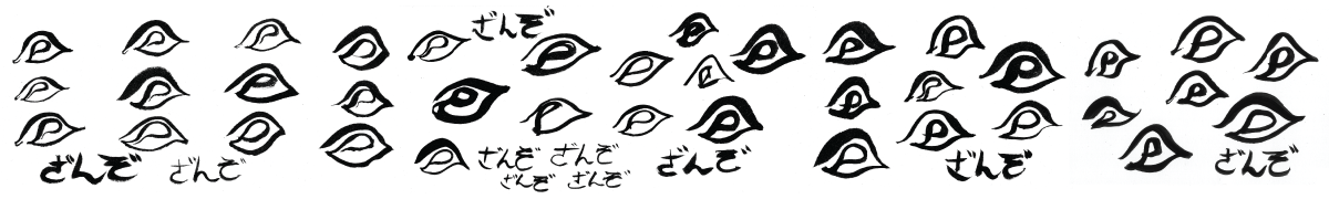
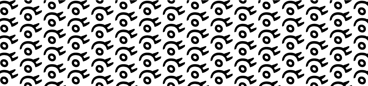
Through the act of marking, I was feeling the lines would lend themselves to making just a simpler eye form. I could also see it scaling better and being animated. I also wanted the logo to both work alone and be incorporated into the company name.

After a logo was decided on we worked through fonts and brand colors. We chose a vibrant red-orange to represent the energy of gameplay and to have contrast flexibility with black and white. Let's Trace by James Kilfiger was chosen as a complimentary fit to the handscripted company name.